
Chapter 9: Weather Reports and Map Analysis
Alison Nugent and David DeCou
Learning Objectives
By the end of this chapter, you should be able to:
- Describe a few global atmospheric observation networks
- Define the meaning of pressure and temperature lines on a map
- Discuss the importance of synoptic maps, and the information required to make one

Introduction
Weather encompasses the state of the atmosphere at any given time, and it is in a constant state of change. Temperature, pressure, humidity, wind, precipitation, cloud cover, visibility—this type of data is constantly being collected around the globe, both at the surface and aloft in the upper atmosphere. How is this data collected and where does it come from? How is it shown on a map? What is the purpose of plotting weather conditions on a map if they are changing all the time? This chapter serves as a brief introduction to surface synoptic weather maps and interpreting the data plotted on them. Simplified weather charts are used frequently on TV, showing locations of high and low pressure systems, fronts, and storm systems. You’re likely familiar with this material already, just from your day to day experiences.
Meteorological Reports and Observations
The World Meteorological Organization (WMO) is a branch of the United Nations and it sets global weather observation standards to be used by countries across the globe. Weather systems span countries and continents so weather observations have to be synchronized to get an accurate big-picture view (a synoptic view) of the weather at a given time. Upper air and surface observations are taken at specific times in Coordinated Universal Time (UTC) so that they can be coordinated simultaneously across different time zones. For example, most upper-air observations are taken at 00 and 12 UTC, but surface observations are typically taken more frequently. Synoptic weather maps put together these observations.
Observations are reported using internationally standardized codes. One of the most commonly used codes is METAR, which comes from the French MÉTéorologique Aviation Régulière, or Meteorological Terminal Aviation Routine. It is a summary of surface weather conditions reported at hourly or half hourly intervals depending on the station. METAR is provided by airport terminals for the purposes of aviation meteorology. In general, METAR includes reports of wind speed and direction, visibility, cloud layers at different levels of the atmosphere, surface temperature and dew point temperature, air pressure, as well as weather conditions such as precipitation or thunderstorms near the station. SPECI is a special non-routine form of METAR, provided when airport weather conditions change significantly. You are not required to translate or memorize METAR for the purposes of this class, but it is useful to recognize it because it is very commonly used. Translations for parts of METAR code can be easily found online.
METAR: PHNL 072153Z 05012KT 10SM FEW025 FEW050 BKN200 31/17 A3006 RMK AO2 SLP180 T03060167
Above is an example of METAR, taken from Honolulu International Airport. “PHNL” is the ICAO airport code for Honolulu International. The “072153Z” indicates that the report was given on the 7th of the month (August 7th) at 2153Z (Universal Time), which is 11:53 AM local time. The “05012KT” is the wind report, and indicates that winds are blowing at 12 knots from 50°, which is roughly from the northeast. The “10SM” indicates that visibility is 10 statute miles, which is another way of saying that visibility on the runway is clear. If visibility is 10 statute miles or greater, it is always reported as just “10SM”. The “FEW025 FEW050 BKN200” are reports of different cloud heights, which are important for aviation purposes. This report says that there are is a layer of a “few” clouds at 2,500 and 5,000 feet, with a layer of “broken” clouds at 20,000 feet. The “31/17” is telling us that the temperature is 31°C with a dew point temperature of 17°C. The “A3006” gives the station air pressure at 30.06 in Hg (inches of Mercury, this unit is still primarily used in aviation). The “RMK” denotes the remarks section of a METAR report where additional remarks and information about the weather are provided. The “AO2” is a code that indicates that the airport observing site is automated and contains a precipitation sensor. Some sites are not automated or do not have a precipitation sensor so there are different codes to denote this. Automated reports can also have non-automated remarks added to them. The “SLP180” gives the sea level pressure as 1018.0 mb. And the “T03060167” gives a more accurate temperature and dew point temperature reading. It reports that the temperature is actually 30.6°C and the dew point temperature is actually 16.7°C.
Weather Observation Locations
Surface weather observations include automated observations from Automated Surface Observing System (ASOS) sites in the United States, as well as hourly observations from airports around the world, reported as METAR. Manual and ship observations are also made at specific times. Surface observations of the weather are important for providing information about the weather conditions that we experience here on the ground. These conditions include temperature, dew point temperature, wind speed and direction, air pressure, cloud cover, visibility, and weather conditions such as precipitation or thunderstorms.
Although surface weather observations are important, they only tell a part of the full story. Just as ripples on the surface of a river can be a sign of what is happening below, surface observations can give an idea of what is happening above. Much of the weather that happens at or near the ground is strongly affected by conditions higher up in the atmosphere.
Observations of the upper atmosphere are taken by radiosonde packages, which are carried aloft by weather balloons. These radiosonde observations (RAOBs) provide soundings of the upper-air environment, giving information about temperature, humidity, and pressure at vertical levels throughout the atmospheric column. Recall from Chapter 5 that temperature and humidity aloft are usually plotted against pressure in a thermodynamic diagram called a Skew-T. Some radiosondes can infer wind data at different heights—these are called rawinsondes. When these instrument packages are dropped from an aircraft, they are called dropsondes. All of this data is accumulated, organized, tested, and stored in computers at governmental centers such as the European Centre for Medium-Range Weather Forecasts (ECMWF). Other data collecting systems include weather radar (such as the NEXRAD network in the United States) and satellite, as well as vertical wind profilers and Radio Acoustic Sounding Systems (RASS).
The following figures show locations of data collected by ECMWF over a 6-hour time period. The first figure shows surface observation locations located on land, the second shows surface observations over the ocean, and the third shows the upper air sounding observational network.


Sea-Level Pressure Adjustment
Weather stations exist at many altitudes. Because air pressure decreases with height, weather stations in cities at high elevations will report far lower air pressures than cities at lower elevations. Air pressure varies vertically far more than it does horizontally. To make air pressure comparable, the station pressure needs to be adjusted to the pressure it would have if the station were at sea level. If this were not done, pressure differences between nearby surface stations would be dominated by their difference in elevation, and a surface pressure map would more closely resemble a map of elevation rather than a map of atmospheric pressure. By correcting for altitude differences, synoptic maps show mean sea level pressure, which is used to show low and high pressure centers near the surface.
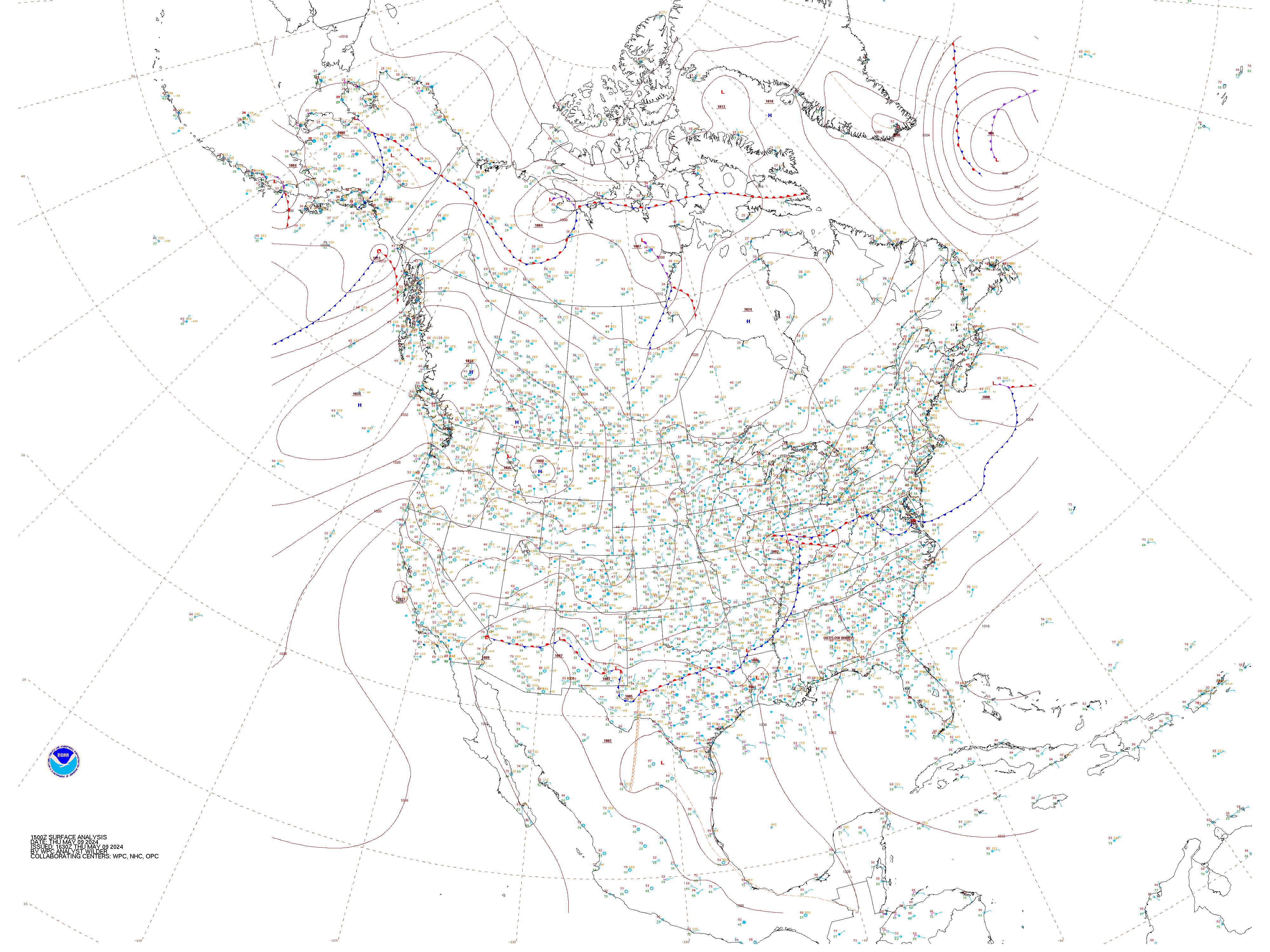
Synoptic Weather Maps
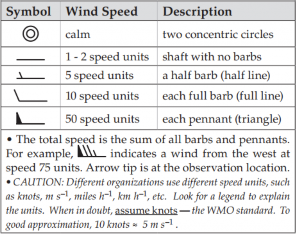
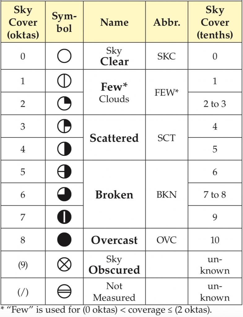
Surface weather observations taken at many weather stations at a given time can be shown on a weather map through the use of a station plot model, an example of which is given below. Station plot models typically provide wind information through wind barbs, as well as current weather conditions, sea level pressure, temperature, dew point temperature, visibility, and cloud cover. Sometimes additional information such as pressure tendency, cloud type, and precipitation amounts are also given.
When reading wind barbs, keep in mind that the flag always points in the direction that the wind is coming from. You can think of it as an arrow flying from a bow, the flag represents the feathers, which are at the back of the arrow in the direction the arrow is coming from. The tip is the direction the arrow is flying toward. More information on wind barb and cloud cover symbols are provided below.
Sea level pressure is typically given in three digits, with the last digit being the nearest tenth. The initial 9 or 10 is left out. So, “147” is actually 1014.7 mb and “998” would be 999.8 mb. When reading station plot pressure, mentally place a decimal point to the left of the third digit, and use your intuition and the pressure of nearby stations in order to decide if the pressure has a leading 9 or 10.

The table below provides information for wind barbs. Two concentric circles with no lines indicates calm wind and a line with no barbs is 1-2 speed units. A half line is 5, a full line is 10, and a triangle is 50. On many weather maps, the unit for winds is given in knots, although different weather maps can use different units so it is always good to check. The lines and triangles are read a bit like roman numerals—just add them up!
The table below provides sky cover information, which is typically shown in the circular center of the station plot model. Depending on the symbol type, it can indicate clear sky or various levels of overcast skies.
Map Analysis
Surface observations as described above are plotted on a map in the form of station plot models, as in the figure below. When looking at the map of raw data below, you can get an idea of the prevailing wind direction in different parts of the US, which areas are experiencing widespread rain, which areas are overcast, and from the wind direction patterns you can even infer centers of high and low pressure. However, much of this information is not very clear without doing some analysis on the map. Map analysis can either be done by hand or by computer, and involves the drawing of contours, or isopleths (lines of equal value) to connect areas of constant air pressure and temperature at the surface. Aloft, contours may be drawn to show areas of constant height, constant humidity, constant wind speed, and other parameters of interest at constant pressure levels. Map analysis also includes drawing and labeling boundaries in the atmosphere, such as fronts or dry lines to show the locations and movement of air masses. Fronts will be covered in a later chapter. Here, we will focus on lines of constant pressure, isobars, and lines of constant temperature, isotherms.

Isopleths
The below figure shows a grid of equally spaced temperature values in °C. When analyzing the temperature on a map, you draw isopleths of constant temperature: isotherms. The main purpose of this is to separate areas of warmer air from cooler air, and to get an idea of how quickly the temperature changes across a horizontal distance, which is also known as the temperature gradient. Isotherms are typically drawn every 5°C on the 5’s – for example, 5°C, 10°C, 15°C, 20°C, 25°C, and so on. Standard conventions are used for contouring on different map surfaces, for example, isotherms are usually dashed and shown in red. You will not need to know these conventions for this class, but it may still come in handy to be aware.
In looking at the below temperature field, you can see that there are many values that do not line up exactly with the lines you need to draw. Many values lie in between contours, such as 4°C and 16°C. You will need to interpolate data, meaning you will have to infer where a datapoint is based on the data around it. Starting from the upper left corner, imagine that you are going to draw your 5°C isotherm. Five lies much closer to 4 than 16, so you will start your isotherm close to the 4. 5°C will also lie in between 3 and 15 °C, but slightly farther away from the 3 value, so you will slope your isotherm down slightly. Five degrees centigrade will also lie in between 2 and 7 °C, so you will continue your isotherm to the right. However, it will slope down even further, because 5 lies closer to 7 than to 2. Your isotherm will then cross directly through the 5°C data point and slope back upward slightly between the 3 and 6 and directly through the middle between the 4 and 6 and back up through the 5 in the upper right hand corner.

The complete contoured example of this temperature field is given below. The atmosphere is a continuous fluid, so any fields that you are contouring (pressure, temperature) will never have values that jump or suddenly end. Contours will either be closed (both ends will connect) or they will extend to the edge of the map. They will never cross or end suddenly. If two contours were to cross, it would mean that one place has two different air temperatures at one time, which is impossible. Areas where isotherms are close together indicate a strong temperature gradient, which may be indicative of a frontal zone.

Isobars
Pressure fields are analyzed by drawing isobars, or lines of constant air pressure. The surface mean sea level pressure is analyzed in much the same way as the isotherms above. However, the conventions are different. Typically, pressure is analyzed every 4 mb and centered on 1000 mb. Isobars are typically drawn as solid black lines. The mean sea level pressure field is analyzed in order to identify areas of high and low pressure, as shown in the figure below. Areas where isobars are drawn close together indicate places where the pressure gradient force is strong. A stronger pressure gradient force is indicative of stronger wind speeds. As you will learn later, winds tend to flow counterclockwise around areas of lower pressure, and clockwise around areas of high pressure in the Northern Hemisphere.

Because weather information is shared across continents and across country borders, it is important to maintain standards such that everyone effectively speaks the same language. Weather is one of the greatest international collaborations ever. If it weren’t for China and Russia sharing their weather information with the US, our long range forecasts would be more inaccurate because we wouldn’t know the initial conditions of the atmosphere upstream of the North American continent.