
Chapter 9. The Neoclassical Perspective
9.2 The Phillips Curve
Learning Objectives
By the end of this section, you will be able to:
- Explain the Phillips curve
- Graph a Phillips curve
- Identify factors that cause the instability of the Phillips curve
- Analyze the Keynesian policy for reducing unemployment and inflation
The simplified AD/AS model that we have used so far is fully consistent with Keynes’s original model. More recent research, though, has indicated that in the real world, an aggregate supply curve is more curved than the right angle that we used in previous chapters. Rather, the real-world AS curve is very flat at levels of output far below potential (“the Keynesian zone”), very steep at levels of output above potential (“the neoclassical zone”) and curved in between (“the intermediate zone”). Figure 9.6 illustrates this. The typical aggregate supply curve leads to the concept of the Phillips curve.

The Discovery of the Phillips Curve
In the 1950s, A.W. Phillips, an economist at the London School of Economics, was studying the Keynesian analytical framework. The Keynesian theory implied that during a recession inflationary pressures are low, but when the level of output is at or even pushing beyond potential GDP, the economy is at greater risk for inflation. Phillips analyzed 60 years of British data and did find that tradeoff between unemployment and inflation, which became known as the Phillips curve. Figure 9.7 shows a theoretical Phillips curve, and the following Work It Out feature shows how the pattern appears for the United States.

The Phillips Curve for the United States
Step 1. Go to this website to access the 2005 Economic Report of the President.
Step 2. Scroll down and locate Table B-63 in the Appendices. This table is titled “Changes in special consumer price indexes, 1960–2004.”
Step 3. Download the table in Excel by selecting the XLS option and then selecting the location in which to save the file.
Step 4. Open the downloaded Excel file.
Step 5. View the third column (labeled “Year to year”). This is the inflation rate, measured by the percentage change in the Consumer Price Index.
Step 6. Return to the website and scroll to locate the Appendix Table B-42 “Civilian unemployment rate, 1959–2004.
Step 7. Download the table in Excel.
Step 8. Open the downloaded Excel file and view the second column. This is the overall unemployment rate.
Step 9. Using the data available from these two tables, plot the Phillips curve for 1960–69, with unemployment rate on the x-axis and the inflation rate on the y-axis. Your graph should look like Figure 9.8.
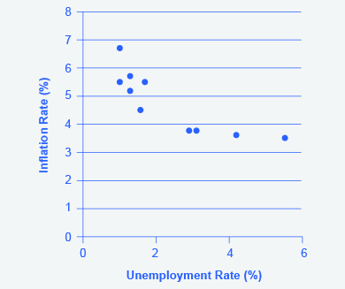
Step 10. Plot the Phillips curve for 1960–1979. What does the graph look like? Do you still see the tradeoff between inflation and unemployment? Your graph should look like Figure 9.9.

Over this longer period of time, the Phillips curve appears to have shifted out. There is no tradeoff any more.
The Instability of the Phillips Curve
During the 1960s, economists viewed the Phillips curve as a policy menu. A nation could choose low inflation and high unemployment, or high inflation and low unemployment, or anywhere in between. Economies could use fiscal and monetary policy to move up or down the Phillips curve as desired. Then a curious thing happened. When policymakers tried to exploit the tradeoff between inflation and unemployment, the result was an increase in both inflation and unemployment. What had happened? The Phillips curve shifted.
The U.S. economy experienced this pattern in the deep recession from 1973 to 1975, and again in back-to-back recessions from 1980 to 1982. Many nations around the world saw similar increases in unemployment and inflation. This pattern became known as stagflation. (Recall from The Aggregate Demand/Aggregate Supply Model that stagflation is an unhealthy combination of high unemployment and high inflation.) Perhaps most important, stagflation was a phenomenon that traditional Keynesian economics could not explain.
Economists have concluded that two factors cause the Phillips curve to shift. The first is supply shocks, like the mid-1970s oil crisis, which first brought stagflation into our vocabulary. The second is changes in people’s expectations about inflation. In other words, there may be a tradeoff between inflation and unemployment when people expect no inflation, but when they realize inflation is occurring, the tradeoff disappears. Both factors (supply shocks and changes in inflationary expectations) cause the aggregate supply curve, and thus the Phillips curve, to shift.
In short, we should interpret a downward-sloping Phillips curve as valid for short-run periods of several years, but over longer periods, when aggregate supply shifts, the downward-sloping Phillips curve can shift so that unemployment and inflation are both higher (as in the 1970s and early 1980s) or both lower (as in the early 1990s or first decade of the 2000s).
The Neoclassical Phillips Curve Tradeoff
The Phillips curve is derived from the aggregate supply curve. The short run upward sloping aggregate supply curve implies a downward sloping Phillips curve; thus, there is a tradeoff between inflation and unemployment in the short run. By contrast, a neoclassical long-run aggregate supply curve will imply a vertical shape for the Phillips curve, indicating no long run tradeoff between inflation and unemployment. Figure 9.10 (a) shows the vertical AS curve, with three different levels of aggregate demand, resulting in three different equilibria, at three different price levels. At every point along that vertical AS curve, potential GDP and the rate of unemployment remains the same. Assume that for this economy, the natural rate of unemployment is 5%. As a result, the long-run Phillips curve relationship, in Figure 9.10 (b), is a vertical line, rising up from 5% unemployment, at any level of inflation. Read the following Work It Out feature for additional information on how to interpret inflation and unemployment rates.

Tracking Inflation and Unemployment Rates
Suppose that you have collected data for years on inflation and unemployment rates and recorded them in a table, such as Table 9.1 below. How do you interpret that information?
| Year | Inflation Rate | Unemployment Rate |
|---|---|---|
| 1970 | 2% | 4% |
| 1975 | 3% | 3% |
| 1980 | 2% | 4% |
| 1985 | 1% | 6% |
| 1990 | 1% | 4% |
| 1995 | 4% | 2% |
| 2000 | 5% | 4% |
Step 1. Plot the data points in a graph with inflation rate on the vertical axis and unemployment rate on the horizontal axis. Your graph will appear similar to Figure 9.11.

Step 2. What patterns do you see in the data? You should notice that there are years when unemployment falls but inflation rises, and other years where unemployment rises and inflation falls.
Step 3. Can you determine the natural rate of unemployment from the data or from the graph? As you analyze the graph, it appears that the natural rate of unemployment lies at 4%. This is the rate that the economy appears to adjust back to after an apparent change in the economy. For example, in 1975 the economy appeared to have an increase in aggregate demand. The unemployment rate fell to 3% but inflation increased from 2% to 3%. By 1980, the economy had adjusted back to 4% unemployment and the inflation rate had returned to 2%. In 1985, the economy looks to have suffered a recession as unemployment rose to 6% and inflation fell to 1%. This would be consistent with a decrease in aggregate demand. By 1990, the economy recovered back to 4% unemployment, but at a lower inflation rate of 1%. In 1995 the economy again rebounded and unemployment fell to 2%, but inflation increased to 4%, which is consistent with a large increase in aggregate demand. The economy adjusted back to 4% unemployment but at a higher rate of inflation of 5%. Then in 2000, both unemployment and inflation increased to 5% and 4%, respectively.
Step 4. Do you see the Phillips curve(s) in the data? If we trace the downward sloping trend of data points, we could see a short-run Phillips curve that exhibits the inverse tradeoff between higher unemployment and lower inflation rates. If we trace the vertical line of data points, we could see a long-run Phillips curve at the 4% natural rate of unemployment.
The unemployment rate on the long-run Phillips curve will be the natural rate of unemployment. A small inflationary increase in the price level from AD0 to AD1 will have the same natural rate of unemployment as a larger inflationary increase in the price level from AD0 to AD2. The macroeconomic equilibrium along the vertical aggregate supply curve can occur at a variety of different price levels, and the natural rate of unemployment can be consistent with all different rates of inflation. The great economist Milton Friedman (1912–2006) summed up the neoclassical view of the long-term Phillips curve tradeoff in a 1967 speech: “[T]here is always a temporary trade-off between inflation and unemployment; there is no permanent trade-off.”
In the Keynesian perspective, the primary focus is on getting the level of aggregate demand right in relationship to an upward-sloping aggregate supply curve. That is, the government should adjust AD so that the economy produces at its potential GDP, not so low that cyclical unemployment results and not so high that inflation results. In the neoclassical perspective, aggregate supply will determine output at potential GDP, the natural rate of unemployment determines unemployment, and shifts in aggregate demand are the primary determinant of changes in the price level.
Self-Check Question – answers available at end of chapter
- How would a decrease in energy prices affect the Phillips curve?
