
Linear Regression and Correlation
Outliers
OpenStaxCollege
[latexpage]
In some data sets, there are values (observed data points) called outliers. Outliers are observed data points that are far from the least squares line. They have large “errors”, where the “error” or residual is the vertical distance from the line to the point.
Outliers need to be examined closely. Sometimes, for some reason or another, they should not be included in the analysis of the data. It is possible that an outlier is a result of erroneous data. Other times, an outlier may
hold valuable information about the population under study and should remain included in the data. The key is to examine carefully what causes a data point to be an outlier.
Besides outliers, a sample may contain one or a few points that are called influential points. Influential points are observed data points that are far from the other observed data points in the horizontal direction. These points may have a big effect on the slope of the regression line. To begin to identify an influential point, you can remove it from the data set and see if the slope of the regression line is changed significantly.
Computers and many calculators can be used to identify outliers from the data. Computer output for regression analysis will often identify both outliers and influential points so that you can examine them.
Identifying Outliers
We could guess at outliers by looking at a graph of the scatterplot and best fit-line. However, we would like some guideline as to how far away a point needs to be in order to be considered an outlier. As a rough rule of thumb, we can flag any point that is located further than two standard deviations above or below the best-fit line as an outlier. The standard deviation used is the standard deviation of the residuals or errors.
We can do this visually in the scatter plot by drawing an extra pair of lines that are two standard deviations above and below the best-fit line. Any data points that are outside this extra pair of lines are flagged as potential outliers. Or we can do this numerically by calculating each residual and comparing it to twice the standard deviation. On the TI-83, 83+, or 84+, the graphical approach is easier. The graphical procedure is shown first, followed by the numerical calculations. You would generally need to use only one of these methods.
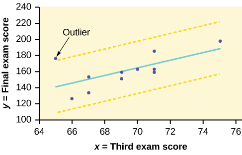
In the third exam/final exam example, you can determine if there is an outlier or not. If there is an outlier, as an exercise, delete it and fit the remaining data to a new line. For this example, the new line ought to fit the remaining data better. This means the SSE should be smaller and the correlation coefficient ought to be closer to 1 or –1.
Graphical Identification of OutliersWith the TI-83, 83+, 84+ graphing calculators, it is easy to identify the outliers graphically and visually. If we were to measure the vertical distance from any data point to the corresponding point on the line of best fit and that distance were equal to 2s or more, then we would consider the data point to be “too far” from the line of best fit. We need to find and graph the lines that are two standard deviations below and above the regression line. Any points that are outside these two lines are outliers. We will call these lines Y2 and Y3:
As we did with the equation of the regression line and the correlation coefficient, we will use technology to calculate this standard deviation for us. Using the LinRegTTest with this data, scroll down through the output screens to find s = 16.412.
Line Y2 = –173.5 + 4.83x –2(16.4) and line Y3 = –173.5 + 4.83x + 2(16.4)
where ŷ = –173.5 + 4.83x is the line of best fit. Y2 and Y3 have the same slope as the line of best fit.
Graph the scatterplot with the best fit line in equation Y1, then enter the two extra lines as Y2 and Y3 in the “Y=”equation editor and press ZOOM 9. You will find that the only data point that is not between lines Y2 and Y3 is the point x = 65, y = 175. On the calculator screen it is just barely outside these lines. The outlier is the student who had a grade of 65 on the third exam and 175 on the final exam; this point is further than two standard deviations away from the best-fit line.
Sometimes a point is so close to the lines used to flag outliers on the graph that it is difficult to tell if the point is between or outside the lines. On a computer, enlarging the graph may help; on a small calculator screen, zooming in may make the graph clearer. Note that when the graph does not give a clear enough picture, you can use the numerical comparisons to identify outliers.
Identify the potential outlier in the scatter plot. The standard deviation of the residuals or errors is approximately 8.6.

The outlier appears to be at (6, 58). The expected y value on the line for the point (6, 58) is approximately 82. Fifty-eight is 24 units from 82. Twenty-four is more than two standard deviations (2s = (2)(8.6) = 17.2 ). So 82 is more than two standard deviations from 58, which makes (6, 58) a potential outlier.
Numerical Identification of Outliers
In [link], the first two columns are the third-exam and final-exam data. The third column shows the predicted ŷ values calculated from the line of best fit: ŷ = –173.5 + 4.83x. The residuals, or errors, have been calculated in the fourth column of the table: observed y value−predicted y value = y − ŷ.
s is the standard deviation of all the y − ŷ = ε values where n = the total number of data points. If each residual is calculated and squared, and the results are added, we get the SSE. The standard deviation of the residuals is calculated from the SSE as:
\(s=\sqrt{\frac{SSE}{n-2}}\)
We divide by (n – 2) because the regression model involves two estimates.
Rather than calculate the value of s ourselves, we can find s using the computer or calculator. For this example, the calculator function LinRegTTest found s = 16.4 as the standard deviation of the residuals 35–1716–6–1993–1–10–9–1.
| x | y | ŷ | y – ŷ |
|---|---|---|---|
| 65 | 175 | 140 | 175 – 140 = 35 |
| 67 | 133 | 150 | 133 – 150= –17 |
| 71 | 185 | 169 | 185 – 169 = 16 |
| 71 | 163 | 169 | 163 – 169 = –6 |
| 66 | 126 | 145 | 126 – 145 = –19 |
| 75 | 198 | 189 | 198 – 189 = 9 |
| 67 | 153 | 150 | 153 – 150 = 3 |
| 70 | 163 | 164 | 163 – 164 = –1 |
| 71 | 159 | 169 | 159 – 169 = –10 |
| 69 | 151 | 160 | 151 – 160 = –9 |
| 69 | 159 | 160 | 159 – 160 = –1 |
We are looking for all data points for which the residual is greater than 2s = 2(16.4) = 32.8 or less than –32.8. Compare these values to the residuals in column four of the table. The only such data point is the student who had a grade of 65 on the third exam and 175 on the final exam; the residual for this student is 35.
How does the outlier affect the best fit line?
Numerically and graphically, we have identified the point (65, 175) as an outlier. We should re-examine the data for this point to see if there are any problems with the data. If there is an error, we should fix the error if possible, or delete the data. If the data is correct, we would leave it in the data set. For this problem, we will suppose that we examined the data and found that this outlier data was an error. Therefore we will continue on and delete the outlier, so that we can explore how it affects the results, as a learning experience.
Compute a new best-fit line and correlation coefficient using the ten remaining points:
On the TI-83, TI-83+, TI-84+ calculators, delete the outlier from L1 and L2. Using the LinRegTTest, the new line of best fit and the correlation coefficient are:
ŷ = –355.19 + 7.39x and r = 0.9121
The new line with r = 0.9121 is a stronger correlation than the original (r = 0.6631) because r = 0.9121 is closer to one. This means that the new line is a better fit to the ten remaining data values. The line can better predict the final exam score given the third exam score.
Numerical Identification of Outliers: Calculating s and Finding Outliers Manually
If you do not have the function LinRegTTest, then you can calculate the outlier in the first example by doing the following.
First, square each |y – ŷ|
The squares are 352172162621929232121029212
Then, add (sum) all the |y – ŷ| squared terms using the formula
\(\stackrel{11}{\underset{i = 1}{\Sigma }}{\left(|{y}_{i}-{\stackrel{^}{y}}_{i}|\right)}^{2}=\stackrel{11}{\underset{i = 1}{\Sigma }}{\epsilon }_{i}{}^{2}\) (Recall that yi – ŷi = εi.)
= 352 + 172 + 162 + 62 + 192 + 92 + 32 + 12 + 102 + 92 + 12
= 2440 = SSE. The result, SSE is the Sum of Squared Errors.
Next, calculate s, the standard deviation of all the y – ŷ = ε values where n = the total number of data points.
The calculation is \(s=\sqrt{\frac{\text{SSE}}{n–2}}\).
For the third exam/final exam problem, \(s=\sqrt{\frac{2440}{11–2}}=16.47\).
Next, multiply s by 2:
(2)(16.47) = 32.94
32.94 is 2 standard deviations away from the mean of the y – ŷ values.
If we were to measure the vertical distance from any data point to the corresponding point on the line of best fit and that distance is at least 2s, then we would consider the data point to be “too far” from the line of best fit. We call that point a potential outlier.
For the example, if any of the |y – ŷ| values are at least 32.94, the corresponding (x, y) data point is a potential outlier.
For the third exam/final exam problem, all the |y – ŷ|’s are less than 31.29 except for the first one which is 35.
35 > 31.29 That is, |y – ŷ| ≥ (2)(s)
The point which corresponds to |y – ŷ| = 35 is (65, 175). Therefore, the data point (65,175) is a potential outlier. For this example, we will delete it. (Remember, we do not always delete an outlier.)
When outliers are deleted, the researcher should either record that data was deleted, and why, or the researcher should provide results both with and without the deleted data. If data is erroneous and the correct values are known (e.g., student one actually scored a 70 instead of a 65), then this correction can be made to the data.
The next step is to compute a new best-fit line using the ten remaining
points. The new line of best fit and the correlation coefficient are:
ŷ = –355.19 + 7.39x and r = 0.9121
Using this new line of best fit (based on the remaining ten data points in the third exam/final exam example), what would a student who receives a 73 on the third exam expect to receive on the final exam? Is this the same as the prediction made using the original line?
Using the new line of best fit, ŷ = –355.19 + 7.39(73) = 184.28. A student who scored 73 points on the third exam would expect to earn 184 points on the final exam.
The original line predicted ŷ = –173.51 + 4.83(73) = 179.08 so the prediction using the new line with the outlier eliminated differs from the original prediction.
The data points for the graph from the third exam/final exam example are as follows: (1, 5), (2, 7), (2, 6), (3, 9), (4, 12), (4, 13), (5, 18), (6, 19), (7, 12), and (7, 21). Remove the outlier and recalculate the line of best fit. Find the value of ŷ when x = 10.
ŷ = 1.04 + 2.96x; 30.64
The Consumer Price Index (CPI) measures the average change over time in the prices paid by urban consumers for consumer goods and services. The CPI affects nearly all Americans because of the many ways it is used. One of its biggest uses is as a measure of inflation. By providing information about price changes in the Nation’s economy to government, business, and labor, the CPI helps them to make economic decisions. The President, Congress, and the Federal Reserve Board use the CPI’s trends to formulate monetary and fiscal policies. In the following table, x is the year and y is the CPI.
| x | y | x | y |
|---|---|---|---|
| 1915 | 10.1 | 1969 | 36.7 |
| 1926 | 17.7 | 1975 | 49.3 |
| 1935 | 13.7 | 1979 | 72.6 |
| 1940 | 14.7 | 1980 | 82.4 |
| 1947 | 24.1 | 1986 | 109.6 |
| 1952 | 26.5 | 1991 | 130.7 |
| 1964 | 31.0 | 1999 | 166.6 |
- Draw a scatterplot of the data.
- Calculate the least squares line. Write the equation in the form ŷ = a + bx.
- Draw the line on the scatterplot.
- Find the correlation coefficient. Is it significant?
- What is the average CPI for the year 1990?
- See [link].
- ŷ = –3204 + 1.662x is the equation of the line of best fit.
- r = 0.8694
- The number of data points is n = 14. Use the 95% Critical Values of the Sample Correlation Coefficient table at the end of Chapter 12. n – 2 = 12. The corresponding critical value is 0.532. Since 0.8694 > 0.532, r is significant.
ŷ = –3204 + 1.662(1990) = 103.4 CPI
- Using the calculator LinRegTTest, we find that s = 25.4 ; graphing the lines Y2 = –3204 + 1.662X – 2(25.4) and Y3 = –3204 + 1.662X + 2(25.4) shows that no data values are outside those lines, identifying no outliers. (Note that the year 1999 was very close to the upper line, but still inside it.)
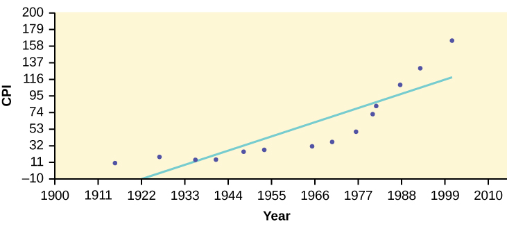
In the example, notice the pattern of the points compared to the line. Although the correlation coefficient is significant, the pattern in the scatterplot indicates that a curve would be a more appropriate model to use than a line. In this example, a statistician should prefer to use other methods to fit a curve to this data, rather than model the data with the line we found. In addition to doing the calculations, it is always important to look at the scatterplot when deciding whether a linear model is appropriate.
If you are interested in seeing more years of data, visit the Bureau of Labor Statistics CPI website ftp://ftp.bls.gov/pub/special.requests/cpi/cpiai.txt; our data is taken from the column entitled “Annual Avg.” (third column from the right). For example you could add more current years of data. Try adding the more recent years: 2004: CPI = 188.9; 2008: CPI = 215.3; 2011: CPI = 224.9. See how it affects the model. (Check: ŷ = –4436 + 2.295x; r = 0.9018. Is r significant? Is the fit better with the addition of the new points?)
The following table shows economic development measured in per capita income PCINC.
| Year | PCINC | Year | PCINC |
|---|---|---|---|
| 1870 | 340 | 1920 | 1050 |
| 1880 | 499 | 1930 | 1170 |
| 1890 | 592 | 1940 | 1364 |
| 1900 | 757 | 1950 | 1836 |
| 1910 | 927 | 1960 | 2132 |
- What are the independent and dependent variables?
- Draw a scatter plot.
- Use regression to find the line of best fit and the correlation coefficient.
- Interpret the significance of the correlation coefficient.
- Is there a linear relationship between the variables?
- Find the coefficient of determination and interpret it.
- What is the slope of the regression equation? What does it mean?
- Use the line of best fit to estimate PCINC for 1900, for 2000.
- Determine if there are any outliers.
a. The independent variable (x) is the year and the dependent variable (y) is the per capita income.
b.

c. ŷ = 18.61x – 34574; r = 0.9732
d. At df = 8, the critical value is 0.632. The r value is significant because it is greater than the critical value.
e. There does appear to be a linear relationship between the variables.
f. The coefficient of determination is 0.947, which means that 94.7% of the variation in PCINC is explained by the variation in the years.
g. and h. The slope of the regression equation is 18.61, and it means that per capita income increases by 💲18.61 for each passing year. ŷ = 785 when the year is 1900, and ŷ = 2,646 when the year is 2000.
i. There do not appear to be any outliers.
95% Critical Values of the Sample Correlation Coefficient Table
| Degrees of Freedom: n – 2 | Critical Values: (+ and –) |
|---|---|
| 1 | 0.997 |
| 2 | 0.950 |
| 3 | 0.878 |
| 4 | 0.811 |
| 5 | 0.754 |
| 6 | 0.707 |
| 7 | 0.666 |
| 8 | 0.632 |
| 9 | 0.602 |
| 10 | 0.576 |
| 11 | 0.555 |
| 12 | 0.532 |
| 13 | 0.514 |
| 14 | 0.497 |
| 15 | 0.482 |
| 16 | 0.468 |
| 17 | 0.456 |
| 18 | 0.444 |
| 19 | 0.433 |
| 20 | 0.423 |
| 21 | 0.413 |
| 22 | 0.404 |
| 23 | 0.396 |
| 24 | 0.388 |
| 25 | 0.381 |
| 26 | 0.374 |
| 27 | 0.367 |
| 28 | 0.361 |
| 29 | 0.355 |
| 30 | 0.349 |
| 40 | 0.304 |
| 50 | 0.273 |
| 60 | 0.250 |
| 70 | 0.232 |
| 80 | 0.217 |
| 90 | 0.205 |
| 100 | 0.195 |
References
Data from the House Ways and Means Committee, the Health and Human Services Department.
Data from Microsoft Bookshelf.
Data from the United States Department of Labor, the Bureau of Labor Statistics.
Data from the Physician’s Handbook, 1990.
Data from the United States Department of Labor, the Bureau of Labor Statistics.
Chapter Review
To determine if a point is an outlier, do one of the following:
\(\begin{array}{l}{y}_{1}=a+bx\hfill \\ {y}_{2}=\left(2s\right)a+bx\hfill \\ {y}_{3}=-\left(2s\right)a+bx\hfill \end{array}\) where s is the standard deviation of the residuals
If any point is above y2or below y3 then the point is considered to be an outlier.
Use the following information to answer the next four exercises. The scatter plot shows the relationship between hours spent studying and exam scores. The line shown is the calculated line of best fit. The correlation coefficient is 0.69.

Do there appear to be any outliers?
Yes, there appears to be an outlier at (6, 58).
A point is removed, and the line of best fit is recalculated. The new correlation coefficient is 0.98. Does the point appear to have been an outlier? Why?
What effect did the potential outlier have on the line of best fit?
The potential outlier flattened the slope of the line of best fit because it was below the data set. It made the line of best fit less accurate is a predictor for the data.
Are you more or less confident in the predictive ability of the new line of best fit?
The Sum of Squared Errors for a data set of 18 numbers is 49. What is the standard deviation?
s = 1.75
The Standard Deviation for the Sum of Squared Errors for a data set is 9.8. What is the cutoff for the vertical distance that a point can be from the line of best fit to be considered an outlier?
Homework
The height (sidewalk to roof) of notable tall buildings in America is compared to the number of stories of the building (beginning at street level).
| Height (in feet) | Stories |
|---|---|
| 1,050 | 57 |
| 428 | 28 |
| 362 | 26 |
| 529 | 40 |
| 790 | 60 |
| 401 | 22 |
| 380 | 38 |
| 1,454 | 110 |
| 1,127 | 100 |
| 700 | 46 |
- Using “stories” as the independent variable and “height” as the dependent variable, make a scatter plot of the data.
- Does it appear from inspection that there is a relationship between the variables?
- Calculate the least squares line. Put the equation in the form of: ŷ = a + bx
- Find the correlation coefficient. Is it significant?
- Find the estimated heights for 32 stories and for 94 stories.
- Based on the data in [link], is there a linear relationship between the number of stories in tall buildings and the height of the buildings?
- Are there any outliers in the data? If so, which point(s)?
- What is the estimated height of a building with six stories? Does the least squares line give an accurate estimate of height? Explain why or why not.
- Based on the least squares line, adding an extra story is predicted to add about how many feet to a building?
- What is the slope of the least squares (best-fit) line? Interpret the slope.
Ornithologists, scientists who study birds, tag sparrow hawks in 13 different colonies to study their population. They gather data for the percent of new sparrow hawks in each colony and the percent of those that have returned from migration.
Percent return:74; 66; 81; 52; 73; 62; 52; 45; 62; 46; 60; 46; 38
Percent new:5; 6; 8; 11; 12; 15; 16; 17; 18; 18; 19; 20; 20
- Enter the data into your calculator and make a scatter plot.
- Use your calculator’s regression function to find the equation of the least-squares regression line. Add this to your scatter plot from part a.
- Explain in words what the slope and y-intercept of the regression line tell us.
- How well does the regression line fit the data? Explain your response.
- Which point has the largest residual? Explain what the residual means in context. Is this point an outlier? An influential point? Explain.
- An ecologist wants to predict how many birds will join another colony of sparrow hawks to which 70% of the adults from the previous year have returned. What is the prediction?
a. and b. Check student’s solution.
c. The slope of the regression line is -0.3179 with a y-intercept of 32.966. In context, the y-intercept indicates that when there are no returning sparrow hawks, there will be almost 31% new sparrow hawks, which doesn’t make sense since if there are no returning birds, then the new percentage would have to be 100% (this is an example of why we do not extrapolate). The slope tells us that for each percentage increase in returning birds, the percentage of new birds in the colony decreases by 0.3179%.
d. If we examine r2, we see that only 50.238% of the variation in the percent of new birds is explained by the model and the correlation coefficient, r = 0.71 only indicates a somewhat strong correlation between returning and new percentages.
e. The ordered pair (66, 6) generates the largest residual of 6.0. This means that when the observed return percentage is 66%, our observed new percentage, 6%, is almost 6% less than the predicted new value of 11.98%. If we remove this data pair, we see only an adjusted slope of -0.2723 and an adjusted intercept of 30.606. In other words, even though this data generates the largest residual, it is not an outlier, nor is the data pair an influential point.
f. If there are 70% returning birds, we would expect to see y = -0.2723(70) + 30.606 = 0.115 or 11.5% new birds in the colony.
The following table shows data on average per capita wine consumption and heart disease rate in a random sample of 10 countries.
| Yearly wine consumption in liters | 2.5 | 3.9 | 2.9 | 2.4 | 2.9 | 0.8 | 9.1 | 2.7 | 0.8 | 0.7 |
| Death from heart diseases | 221 | 167 | 131 | 191 | 220 | 297 | 71 | 172 | 211 | 300 |
- Enter the data into your calculator and make a scatter plot.
- Use your calculator’s regression function to find the equation of the least-squares regression line. Add this to your scatter plot from part a.
- Explain in words what the slope and y-intercept of the regression line tell us.
- How well does the regression line fit the data? Explain your response.
- Which point has the largest residual? Explain what the residual means in context. Is this point an outlier? An influential point? Explain.
- Do the data provide convincing evidence that there is a linear relationship between the amount of alcohol consumed and the heart disease death rate? Carry out an appropriate test at a significance level of 0.05 to help answer this question.
The following table consists of one student athlete’s time (in minutes) to swim 2000 yards and the student’s heart rate (beats per minute) after swimming on a random sample of 10 days:
| Swim Time | Heart Rate |
|---|---|
| 34.12 | 144 |
| 35.72 | 152 |
| 34.72 | 124 |
| 34.05 | 140 |
| 34.13 | 152 |
| 35.73 | 146 |
| 36.17 | 128 |
| 35.57 | 136 |
| 35.37 | 144 |
| 35.57 | 148 |
- Enter the data into your calculator and make a scatter plot.
- Use your calculator’s regression function to find the equation of the least-squares regression line. Add this to your scatter plot from part a.
- Explain in words what the slope and y-intercept of the regression line tell us.
- How well does the regression line fit the data? Explain your response.
- Which point has the largest residual? Explain what the residual means in context. Is this point an outlier? An influential point? Explain.
- Check student’s solution.
- Check student’s solution.
- We have a slope of –1.4946 with a y-intercept of 193.88. The slope, in context, indicates that for each additional minute added to the swim time, the heart rate will decrease by 1.5 beats per minute. If the student is not swimming at all, the y-intercept indicates that his heart rate will be 193.88 beats per minute. While the slope has meaning (the longer it takes to swim 2,000 meters, the less effort the heart puts out), the y-intercept does not make sense. If the athlete is not swimming (resting), then his heart rate should be very low.
- Since only 1.5% of the heart rate variation is explained by this regression equation, we must conclude that this association is not explained with a linear relationship.
- The point (34.72, 124) generates the largest residual of –11.82. This means that our observed heart rate is almost 12 beats less than our predicted rate of 136 beats per minute. When this point is removed, the slope becomes 1.6914 with the y-intercept changing to 83.694. While the linear association is still very weak, we see that the removed data pair can be considered an influential point in the sense that the y-intercept becomes more meaningful.
A researcher is investigating whether non-white minorities commit a disproportionate number of homicides. He uses demographic data from Detroit, MI to compare homicide rates and the number of the population that are white males.
| White Males | Homicide rate per 100,000 people |
|---|---|
| 558,724 | 8.6 |
| 538,584 | 8.9 |
| 519,171 | 8.52 |
| 500,457 | 8.89 |
| 482,418 | 13.07 |
| 465,029 | 14.57 |
| 448,267 | 21.36 |
| 432,109 | 28.03 |
| 416,533 | 31.49 |
| 401,518 | 37.39 |
| 387,046 | 46.26 |
| 373,095 | 47.24 |
| 359,647 | 52.33 |
- Use your calculator to construct a scatter plot of the data. What should the independent variable be? Why?
- Use your calculator’s regression function to find the equation of the least-squares regression line. Add this to your scatter plot.
- Discuss what the following mean in context.
- The slope of the regression equation
- The y-intercept of the regression equation
- The correlation r
- The coefficient of determination r2.
- Do the data provide convincing evidence that there is a linear relationship between the number of white males in the population and the homicide rate? Carry out an appropriate test at a significance level of 0.05 to help answer this question.
| School | Mid-Career Salary (in thousands) | Yearly Tuition |
|---|---|---|
| Princeton | 137 | 28,540 |
| Harvey Mudd | 135 | 40,133 |
| CalTech | 127 | 39,900 |
| US Naval Academy | 122 | 0 |
| West Point | 120 | 0 |
| MIT | 118 | 42,050 |
| Lehigh University | 118 | 43,220 |
| NYU-Poly | 117 | 39,565 |
| Babson College | 117 | 40,400 |
| Stanford | 114 | 54,506 |
Using the data to determine the linear-regression line equation with the outliers removed. Is there a linear correlation for the data set with outliers removed? Justify your answer.
If we remove the two service academies (the tuition is 💲0.00), we construct a new regression equation of y = –0.0009x + 160 with a correlation coefficient of 0.71397 and a coefficient of determination of 0.50976. This allows us to say there is a fairly strong linear association between tuition costs and salaries if the service academies are removed from the data set.
Bring It Together
The average number of people in a family that received welfare for various years is given in [link].
| Year | Welfare family size |
|---|---|
| 1969 | 4.0 |
| 1973 | 3.6 |
| 1975 | 3.2 |
| 1979 | 3.0 |
| 1983 | 3.0 |
| 1988 | 3.0 |
| 1991 | 2.9 |
- Using “year” as the independent variable and “welfare family size” as the dependent variable, draw a scatter plot of the data.
- Calculate the least-squares line. Put the equation in the form of: ŷ = a + bx
- Find the correlation coefficient. Is it significant?
- Pick two years between 1969 and 1991 and find the estimated welfare family sizes.
- Based on the data in [link], is there a linear relationship between the year and the average number of people in a welfare family?
- Using the least-squares line, estimate the welfare family sizes for 1960 and 1995. Does the least-squares line give an accurate estimate for those years? Explain why or why not.
- Are there any outliers in the data?
- What is the estimated average welfare family size for 1986? Does the least squares line give an accurate estimate for that year? Explain why or why not.
- What is the slope of the least squares (best-fit) line? Interpret the slope.
The percent of female wage and salary workers who are paid hourly rates is given in [link] for the years 1979 to 1992.
| Year | Percent of workers paid hourly rates |
|---|---|
| 1979 | 61.2 |
| 1980 | 60.7 |
| 1981 | 61.3 |
| 1982 | 61.3 |
| 1983 | 61.8 |
| 1984 | 61.7 |
| 1985 | 61.8 |
| 1986 | 62.0 |
| 1987 | 62.7 |
| 1990 | 62.8 |
| 1992 | 62.9 |
- Using “year” as the independent variable and “percent” as the dependent variable, draw a scatter plot of the data.
- Does it appear from inspection that there is a relationship between the variables? Why or why not?
- Calculate the least-squares line. Put the equation in the form of: ŷ = a + bx
- Find the correlation coefficient. Is it significant?
- Find the estimated percents for 1991 and 1988.
- Based on the data, is there a linear relationship between the year and the percent of female wage and salary earners who are paid hourly rates?
- Are there any outliers in the data?
- What is the estimated percent for the year 2050? Does the least-squares line give an accurate estimate for that year? Explain why or why not.
- What is the slope of the least-squares (best-fit) line? Interpret the slope.
- Check student’s solution.
- yes
- ŷ = −266.8863+0.1656x
- 0.9448; Yes
- 62.8233; 62.3265
- yes
- yes; (1987, 62.7)
- 72.5937; no
- slope = 0.1656.
As the year increases by one, the percent of workers paid hourly rates tends to increase by 0.1656.
Use the following information to answer the next two exercises. The cost of a leading liquid laundry detergent in different sizes is given in [link].
| Size (ounces) | Cost (💲) | Cost per ounce |
|---|---|---|
| 16 | 3.99 | |
| 32 | 4.99 | |
| 64 | 5.99 | |
| 200 | 10.99 |
- Using “size” as the independent variable and “cost” as the dependent variable, draw a scatter plot.
- Does it appear from inspection that there is a relationship between the variables? Why or why not?
- Calculate the least-squares line. Put the equation in the form of: ŷ = a + bx
- Find the correlation coefficient. Is it significant?
- If the laundry detergent were sold in a 40-ounce size, find the estimated cost.
- If the laundry detergent were sold in a 90-ounce size, find the estimated cost.
- Does it appear that a line is the best way to fit the data? Why or why not?
- Are there any outliers in the given data?
- Is the least-squares line valid for predicting what a 300-ounce size of the laundry detergent would you cost? Why or why not?
- What is the slope of the least-squares (best-fit) line? Interpret the slope.
- Complete [link] for the cost per ounce of the different sizes.
- Using “size” as the independent variable and “cost per ounce” as the dependent variable, draw a scatter plot of the data.
- Does it appear from inspection that there is a relationship between the variables? Why or why not?
- Calculate the least-squares line. Put the equation in the form of: ŷ = a + bx
- Find the correlation coefficient. Is it significant?
- If the laundry detergent were sold in a 40-ounce size, find the estimated cost per ounce.
- If the laundry detergent were sold in a 90-ounce size, find the estimated cost per ounce.
- Does it appear that a line is the best way to fit the data? Why or why not?
- Are there any outliers in the the data?
- Is the least-squares line valid for predicting what a 300-ounce size of the laundry detergent would cost per ounce? Why or why not?
- What is the slope of the least-squares (best-fit) line? Interpret the slope.
-
Size (ounces) Cost (💲) cents/oz 16 3.99 24.94 32 4.99 15.59 64 5.99 9.36 200 10.99 5.50 - Check student’s solution.
- There is a linear relationship for the sizes 16 through 64, but that linear trend does not continue to the 200-oz size.
- ŷ = 20.2368 – 0.0819x
- r = –0.8086
- 40-oz: 16.96 cents/oz
- 90-oz: 12.87 cents/oz
- The relationship is not linear; the least squares line is not appropriate.
- no outliers
- No, you would be extrapolating. The 300-oz size is outside the range of x.
- slope = –0.08194; for each additional ounce in size, the cost per ounce decreases by 0.082 cents.
According to a flyer by a Prudential Insurance Company representative, the costs of approximate probate fees and taxes for selected net taxable estates are as follows:
| Net Taxable Estate (💲) | Approximate Probate Fees and Taxes (💲) |
|---|---|
| 600,000 | 30,000 |
| 750,000 | 92,500 |
| 1,000,000 | 203,000 |
| 1,500,000 | 438,000 |
| 2,000,000 | 688,000 |
| 2,500,000 | 1,037,000 |
| 3,000,000 | 1,350,000 |
- Decide which variable should be the independent variable and which should be the dependent variable.
- Draw a scatter plot of the data.
- Does it appear from inspection that there is a relationship between the variables? Why or why not?
- Calculate the least-squares line. Put the equation in the form of: ŷ = a + bx.
- Find the correlation coefficient. Is it significant?
- Find the estimated total cost for a next taxable estate of 💲1,000,000. Find the cost for 💲2,500,000.
- Does it appear that a line is the best way to fit the data? Why or why not?
- Are there any outliers in the data?
- Based on these results, what would be the probate fees and taxes for an estate that does not have any assets?
- What is the slope of the least-squares (best-fit) line? Interpret the slope.
The following are advertised sale prices of color televisions at Anderson’s.
| Size (inches) | Sale Price (💲) |
|---|---|
| 9 | 147 |
| 20 | 197 |
| 27 | 297 |
| 31 | 447 |
| 35 | 1177 |
| 40 | 2177 |
| 60 | 2497 |
- Decide which variable should be the independent variable and which should be the dependent variable.
- Draw a scatter plot of the data.
- Does it appear from inspection that there is a relationship between the variables? Why or why not?
- Calculate the least-squares line. Put the equation in the form of: ŷ = a + bx
- Find the correlation coefficient. Is it significant?
- Find the estimated sale price for a 32 inch television. Find the cost for a 50 inch television.
- Does it appear that a line is the best way to fit the data? Why or why not?
- Are there any outliers in the data?
- What is the slope of the least-squares (best-fit) line? Interpret the slope.
- Size is x, the independent variable, price is y, the dependent variable.
- Check student’s solution.
- The relationship does not appear to be linear.
- ŷ = –745.252 + 54.75569x
- r = 0.8944, yes it is significant
- 32-inch: 💲1006.93, 50-inch: 💲1992.53
- No, the relationship does not appear to be linear. However, r is significant.
- yes, the 60-inch TV
- For each additional inch, the price increases by 💲54.76
[link] shows the average heights for American boy s in 1990.
| Age (years) | Height (cm) |
|---|---|
| birth | 50.8 |
| 2 | 83.8 |
| 3 | 91.4 |
| 5 | 106.6 |
| 7 | 119.3 |
| 10 | 137.1 |
| 14 | 157.5 |
- Decide which variable should be the independent variable and which should be the dependent variable.
- Draw a scatter plot of the data.
- Does it appear from inspection that there is a relationship between the variables? Why or why not?
- Calculate the least-squares line. Put the equation in the form of: ŷ = a + bx
- Find the correlation coefficient. Is it significant?
- Find the estimated average height for a one-year-old. Find the estimated average height for an eleven-year-old.
- Does it appear that a line is the best way to fit the data? Why or why not?
- Are there any outliers in the data?
- Use the least squares line to estimate the average height for a sixty-two-year-old man. Do you think that your answer is reasonable? Why or why not?
- What is the slope of the least-squares (best-fit) line? Interpret the slope.
| State | # letters in name | Year entered the Union | Ranks for entering the Union | Area (square miles) |
|---|---|---|---|---|
| Alabama | 7 | 1819 | 22 | 52,423 |
| Colorado | 8 | 1876 | 38 | 104,100 |
| Hawaii | 6 | 1959 | 50 | 10,932 |
| Iowa | 4 | 1846 | 29 | 56,276 |
| Maryland | 8 | 1788 | 7 | 12,407 |
| Missouri | 8 | 1821 | 24 | 69,709 |
| New Jersey | 9 | 1787 | 3 | 8,722 |
| Ohio | 4 | 1803 | 17 | 44,828 |
| South Carolina | 13 | 1788 | 8 | 32,008 |
| Utah | 4 | 1896 | 45 | 84,904 |
| Wisconsin | 9 | 1848 | 30 | 65,499 |
We are interested in whether there is a relationship between the ranking of a state and the area of the state.
- What are the independent and dependent variables?
- What do you think the scatter plot will look like? Make a scatter plot of the data.
- Does it appear from inspection that there is a relationship between the variables? Why or why not?
- Calculate the least-squares line. Put the equation in the form of: ŷ = a + bx
- Find the correlation coefficient. What does it imply about the significance of the relationship?
- Find the estimated areas for Alabama and for Colorado. Are they close to the actual areas?
- Use the two points in part f to plot the least-squares line on your graph from part b.
- Does it appear that a line is the best way to fit the data? Why or why not?
- Are there any outliers?
- Use the least squares line to estimate the area of a new state that enters the Union. Can the least-squares line be used to predict it? Why or why not?
- Delete “Hawaii” and substitute “Alaska” for it. Alaska is the forty-ninth, state with an area of 656,424 square miles.
- Calculate the new least-squares line.
- Find the estimated area for Alabama. Is it closer to the actual area with this new least-squares line or with the previous one that included Hawaii? Why do you think that’s the case?
- Do you think that, in general, newer states are larger than the original states?
- Let rank be the independent variable and area be the dependent variable.
- Check student’s solution.
- There appears to be a linear relationship, with one outlier.
- ŷ (area) = 24177.06 + 1010.478x
- r = 0.50047, r is not significant so there is no relationship between the variables.
- Alabama: 46407.576 Colorado: 62575.224
- Alabama estimate is closer than Colorado estimate.
- If the outlier is removed, there is a linear relationship.
- There is one outlier (Hawaii).
- rank 51: 75711.4; no
-
Alabama 7 1819 22 52,423 Colorado 8 1876 38 104,100 Alaska 6 1959 51 656,424 Iowa 4 1846 29 56,276 Maryland 8 1788 7 12,407 Missouri 8 1821 24 69,709 New Jersey 9 1787 3 8,722 Ohio 4 1803 17 44,828 South Carolina 13 1788 8 32,008 Utah 4 1896 45 84,904 Wisconsin 9 1848 30 65,499 - ŷ = –87065.3 + 7828.532x
- Alabama: 85,162.404; the prior estimate was closer. Alaska is an outlier.
- yes, with the exception of Hawaii
Glossary
- Outlier
- an observation that does not fit the rest of the data
